
6 Nations Rugby
Service (s)
Visual identity design
Year
2024

6 Nations Rugby stands as the trusted guardian and operator of the world’s most premier international rugby tournaments; including the renowned Men’s, Women’s and Under-20 Six Nations, and the thrilling Autumn Nations Series. Despite being updated over the years, their corporate brand has shared the same identity as their championship brands since the organisation established in 1883. Unsurprisingly, this risked confusion amongst fans, employees and partner organisations. Being the figurehead of international rugby, 6 Nations needed clearer delineation between their championships and corporate brand.

Don’t freak out, don’t freak out, don’t freak out
Developed by How Now Creative, each of the championship brands received a significant identity update over the last 3 years with all of them sharing a distinct visual style making them feel part of the same family. But this left the corporate brand using the same identity the Men’s tournament had gotten rid of. They needed something new - something premium, modern and professional to better communicate that 6 Nations Rugby is the rugby organisation of the world.
Honestly, I couldn’t quite believe I got the call up to design the new identity for the corporate brand. I had to rub my eyes a few times when the message came through from Mike, the Lead Creative (what a guy btw). But after a couple of calls, a few emails and an agonising wait to hear back from my proposal, I somehow landed the job. Mind blown. After the initial freakout of excitement, the pressure to deliver something great then took over.
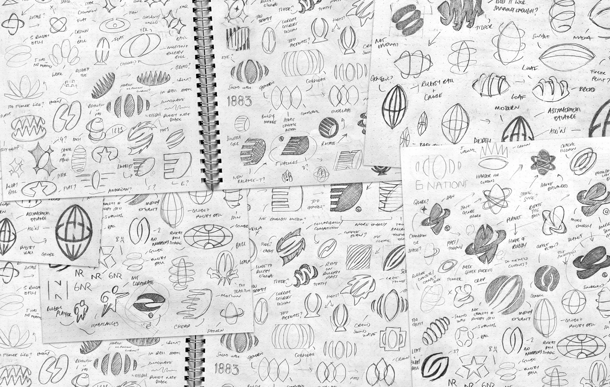
To calm my nerves, I did as much research as humanly possible to ensure I had all the information stored away like a little rugby-obsessed squirrel. I dove into analysing other rugby competitions’/leagues’ branding along with leaders in other sports such as F1, UFC, and The Premier League. As part of the brief, the 6 Nations team were very clear they wanted their new logo to be unmistakably rugby regardless of language. ‘No problem’ I thought. However, almost all other rugby brands seemed to have had a similar must-have in their briefs as they typically utilise a rugby ball in their logo. Saying that though, the executions varied drastically. Some felt a little dated whilst others very confidently leant into a futuristic style. This left an opportunity to create something unmistakably rugby that would work yesterday, today and tomorrow.

Try not to cry
During my conversations with the team, I raised the point that 6 Nations had previously been 5 nations and one point, even 4. So, hero-ing the 6 numeral in the new logo felt a little risky as they may incorporate more nations into the tournament down the line. With that in mind, I spent a lot of time playing with N letterforms, timeless rugby ball silhouettes and globes to reference their international reach. Sometimes when you’re designing logomarks, it feels like your bashing your head against a wall and you begin to doubt your entire skillset praying for a Eureka! moment. The stakes were extra high for this project being the biggest brand I had ever worked with up until this point so the head bashing and self-doubt amplified big time…but so did the Eureka! moment. Almost as if there was some divine intervention by the logo gods, I managed to combine a rugby ball as it stands proudly on a kicking tee before the game kicks off with the longitudinal and latitudinal lines of a globe. I also worked in a sneaky negative space N letterform.
I blew this mark out into a wholly comprehensive brand presentation pairing it with some geometric and robust typography and a palette of rich trustworthy hues with a burst of energetic colour. I was dead chuffed. After presenting, it was met with some fantastic initial thoughts but sadly, after much deliberation internally and a reshuffle of the brief, it wasn’t to be. Whilst aligning with the team on next steps, we agreed the next direction needed to display more motion, more heritage and even more rugby.


A sidestep in the direction
I spent a lot of time thinking about other quintessential ‘rugby’ things. A try? Conversion? Scrum? All possible but all quite tricky to draw in a simple form. It then hit me that the line out from a front-on view could be an area to explore. After sketching a bunch of different, and mainly terrible, executions, another welcomed intervention from the logo gods gave me the idea to combine the line out with a crown symbolising 6 Nations’ heritage and their rightful place as leaders in their industry. To support this new direction I worked on some new type and colours cementing this shift in tone. Again, this direction was very warmly received by the team widely achieving sign off amongst the, frankly, humungous list of stakeholders. Ultimately though, we weren’t able to get this mark over the line either as it may infer that each nation has a royal connection. Which is true for all the teams - except Ireland. It was at this point I was feeling quite creatively worn out and my old friend self-doubt was rearing his ugly face again but the team at 6 Nations and Mike in particular couldn’t have been more supportive and encouraging.
It was time to go again!


Parity and cohesion
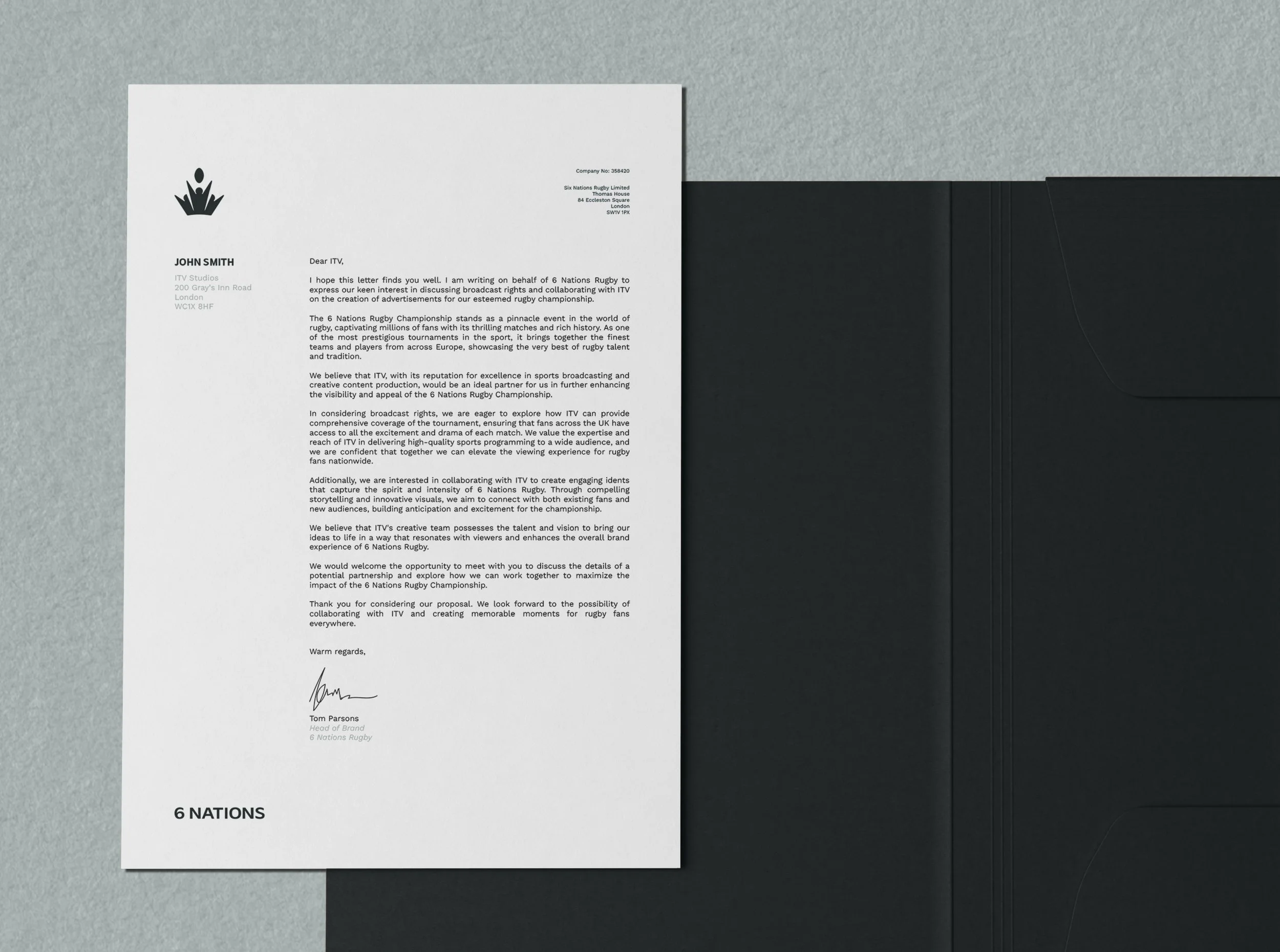
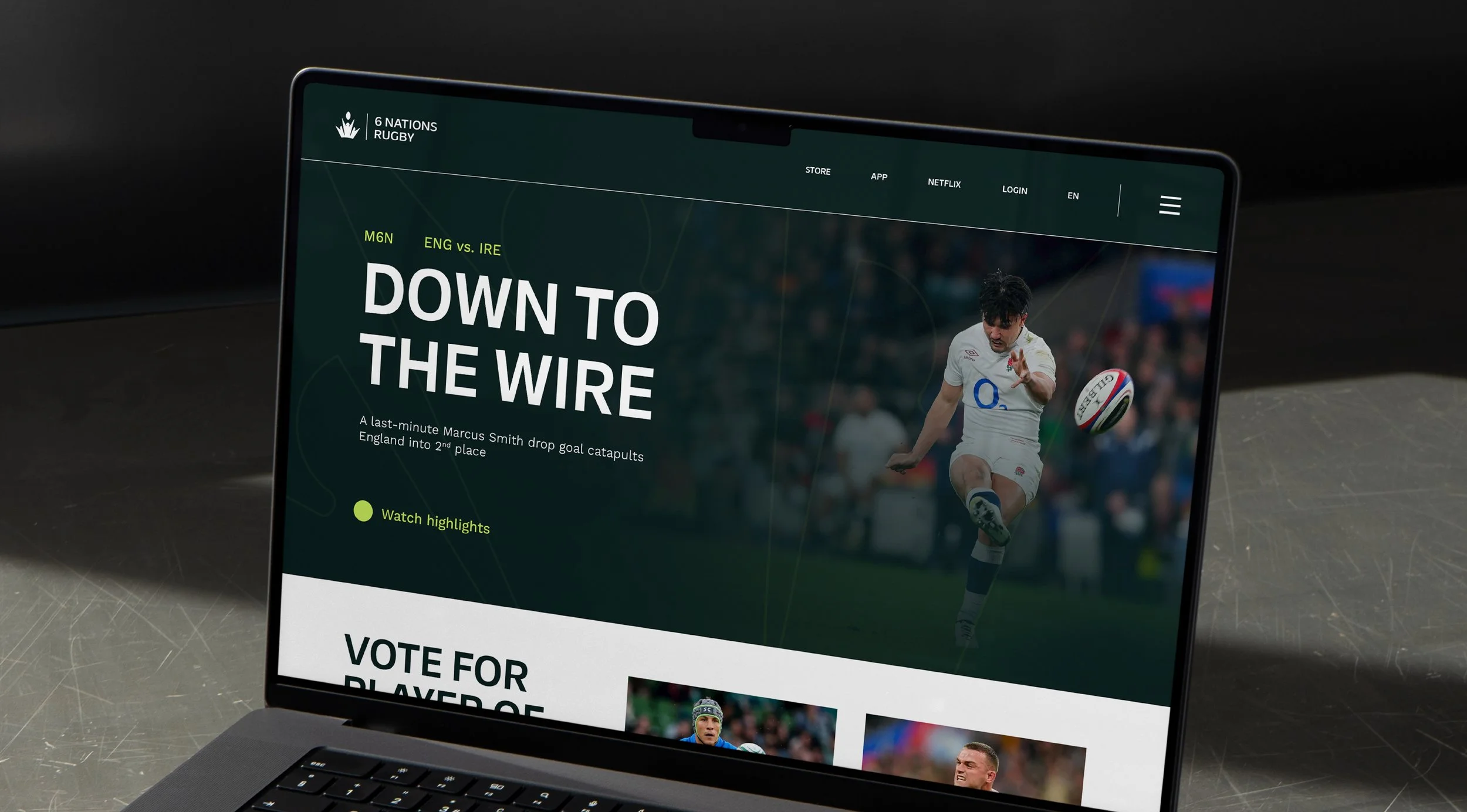
After this round, the brief was slightly modified again and with it came few very helpful suggestions. I was provided with a rough logomark idea designed internally that had achieved sign off amongst the nations and the board - all I needed to do was tidy it up a little. Rooted in the design was the same tilted rugby ball shape used in the championship brands creating a real synergy amongst the organisation. Along with the logomark guidance, came the decision to dial back the colour palette to avoid potential clashes with any of the teams as well as using the same type pairing as the championship brands. After implementing these changes and 9+ months of collaboration, we achieved sign off with the full team at 6 Nations and the work has now been launched across their site, app and merchandise. How mad is that?


What a wild ride, did we have a good time?
What an unbelievable experience it was to work with the big boys. I learned so much about myself as a designer; pushing myself to new heights and picking myself up when I felt a little dejected. I’m beyond grateful to have worked with such a talented bunch. Here’s some exceptionally kind words from Mike about his experience working together on this mega project:
“We had the pleasure of working with Jack Chitty on our new corporate logo for Six Nations, and we couldn't be happier with the outcome. Jack was incredibly accommodating to our requests, even as we explored numerous changes along the way. His creative thinking and fresh ideas brought our vision to life, and his patience and attention to detail made the entire process seamless. We highly recommend Jack to anyone looking for innovative design work and a truly collaborative experience. Thank you, Jack”