Consulterce
Service (s)
Bespoke identity design
Year
2024
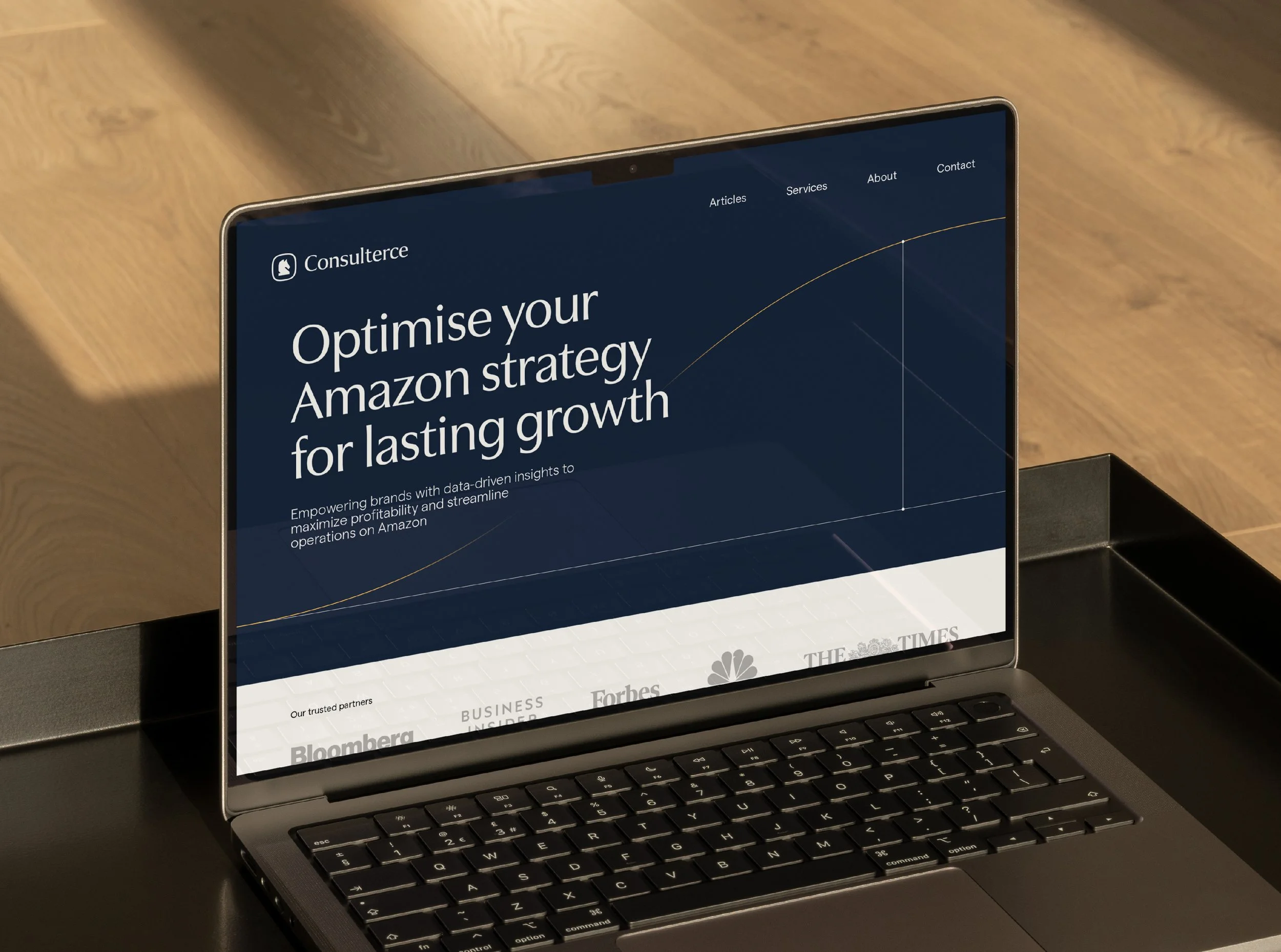
Consulterce is a specialised consultancy dedicated to helping FMCG and B2C brands optimise their profitability on Amazon. With deep expertise in navigating Amazon’s unique marketplace dynamics, Consulterce provides strategic guidance on trade negotiations, pricing, and distribution, empowering brands to achieve sustainable growth. Martin asked me to refresh his brand’s identity ensuring the new design provided more flexibility for creating brand assets and as whole feel more cohesive. In a sense, change everything without making it feel different. Easy peasy. *gulp*
A knight & day difference
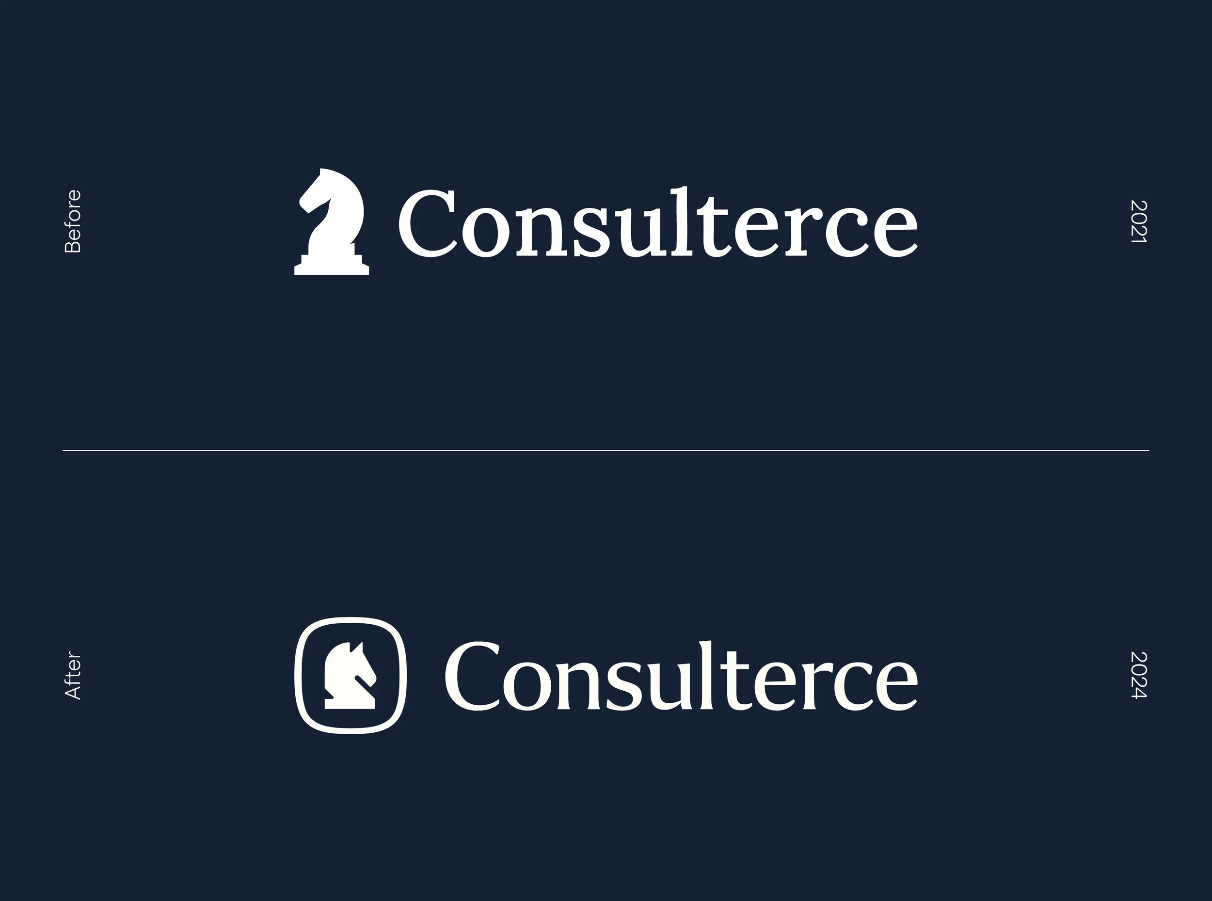
Despite figuring out Consulterce’s brand identity without professional support, Martin had cleverly tapped into symbolism within his logo design. Capturing strategic thinking perfectly, the knight chess piece had to stay in his brand refresh and it was up to me to make it more functional, memorable and timeless. I highlighted a few key areas for improvement in Consulterce’s original logo:
The height of the knight meant that it wasn’t taking full advantage of horizontal space resulting in scalability challenges
Many unnecessary anchor points, particularly under the jaw of the knight and at the base, increased the file size and impacted legibility at smaller scales
Having the knight face left felt as though it was looking into the past rather than looking toward the future
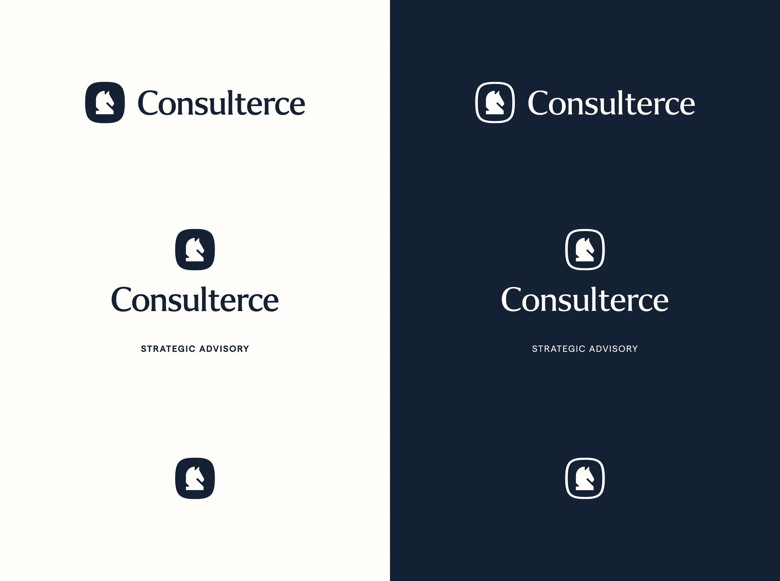
With these areas in mind, I cracked through tens and tens of sketches starting each with a geometric base with the aim to minimise unnecessary anchor points and maximise scalability. After a couple of iterations, I landed on this exceptionally reductive, minimal knight that communicates the same story as the previous logomark in a more succinct and effortless way.
Horsing around with type & colour
Having cracked the logomark, I turned my attention to the logo typeface. Martin was using Merriweather at the time which effectively told the story of his trustworthy expertise but lacked individuality. After trawling various foundries trying to find a typeface that felt reliable yet approachable and unique yet classic, I eventually found Utile Display. I loooove this typeface - it oozes sophistication without being too stuffy and feels perfectly at home decades ago as it does today. Yum.
To support Utile Display, I opted for an old friend of mine, Matter. A characterful sans-serif that again, feels at home in just about any era and brings a lovely human feel that Utile Display lacks, making the quite the perfect pair.
Moving on to one of my favourite topics - colour. Consulterce’s existing palette was very heavily influenced by Amazon’s brand - a relatively desaturated royal blue, white and an accent yellow. But having discussed Martin’s future plans for his advisory, potentially consulting across other verticals and platforms, we decided to elevate this palette beyond this whilst keeping the core DNA the same. I tweaked those primary colours slightly, making the blue and yellow pop whilst warming up the white. To bolster these, I included a charming baby blue and a friendly off-white in alabaster whilst adding a mid grey tone to further elevate element hierarchies in the rest of the identity.
Stress testing the new identity
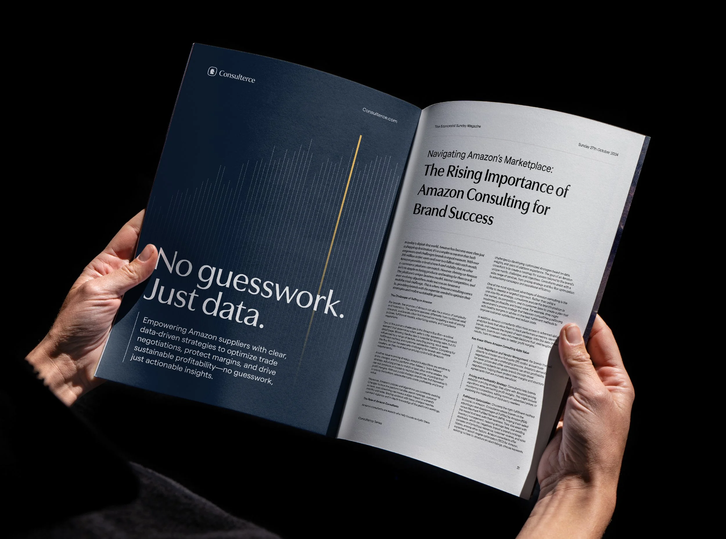
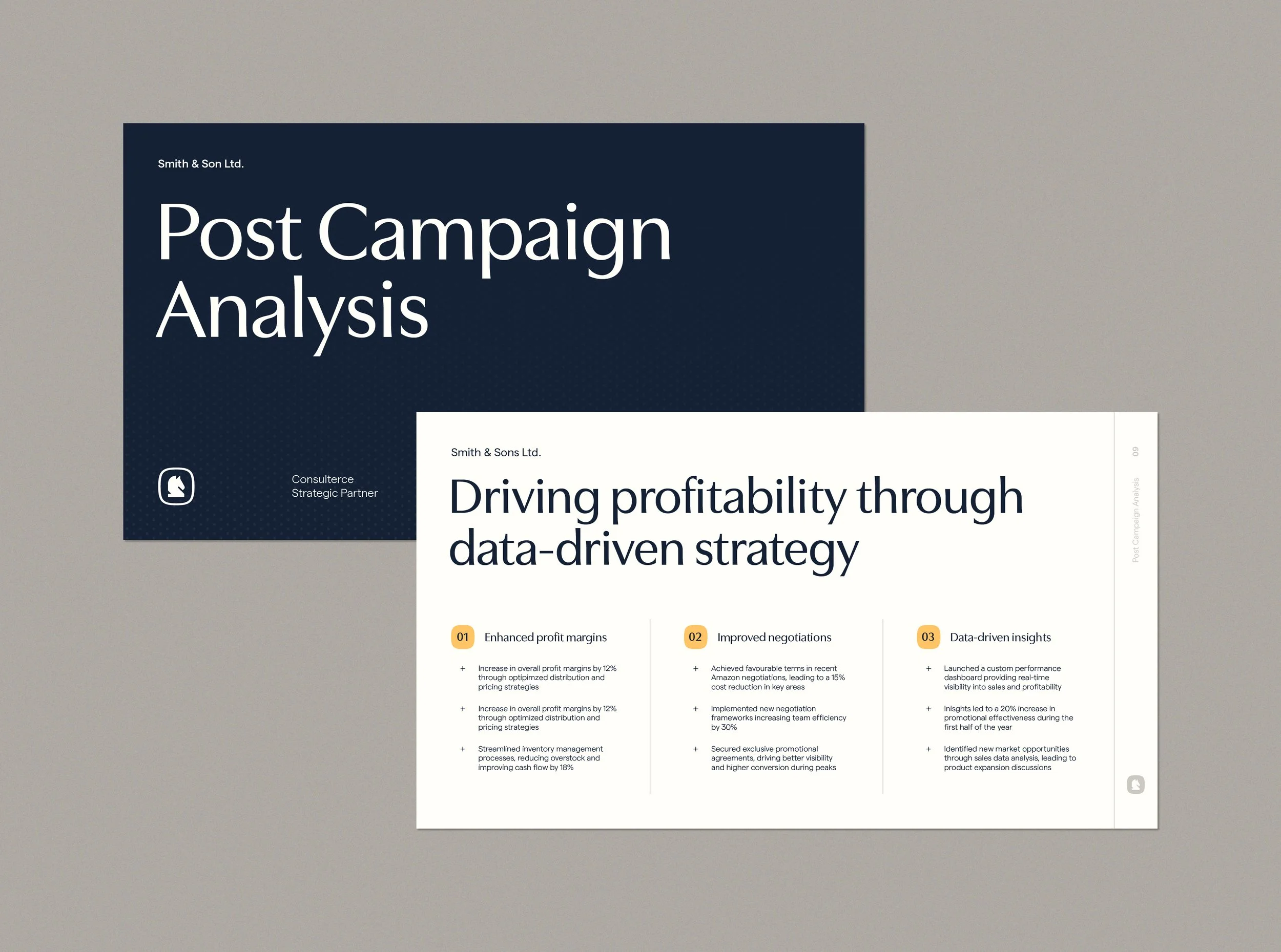
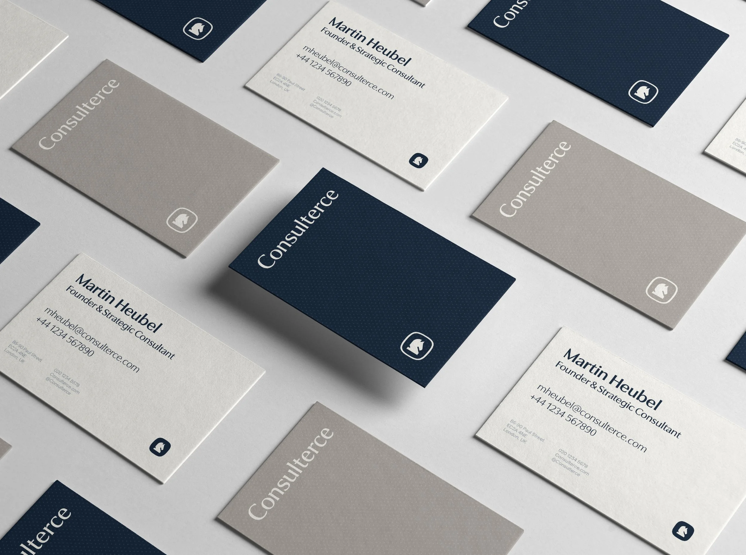
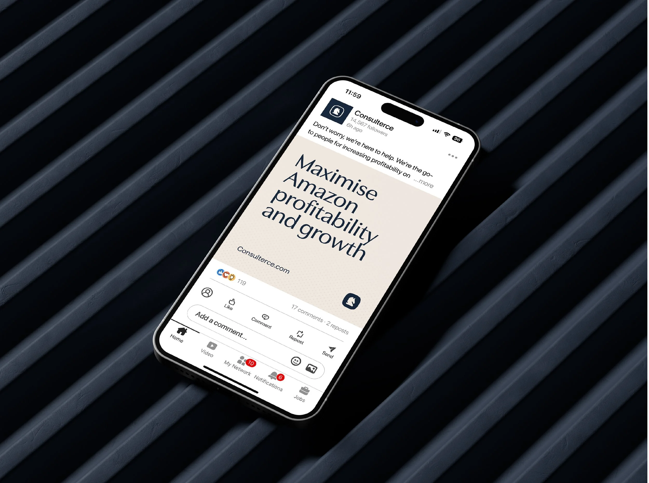
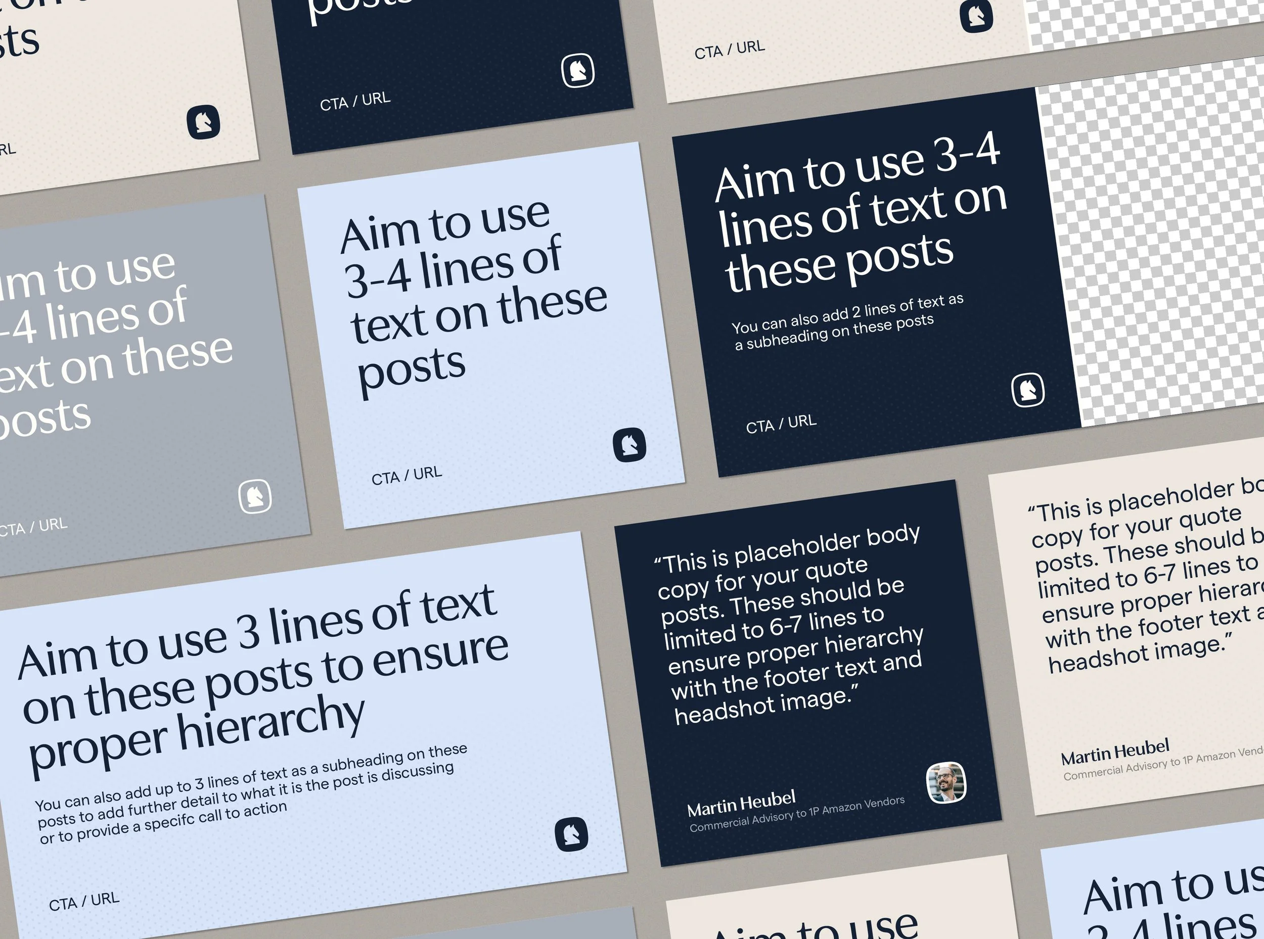
After working with Martin to make couple of tweaks here and there to finalise the identity, he asked me to support him with rolling out his new brand. This meant creating several editable social media templates for use across his primary social platform, LinkedIn, a wealth of blog post covers and a bespoke business card design.
Having completed Consulterce’s brand guidelines prior to this meant that all I needed to do was implement the guidance and rules I had outlined in this document across these assets. Although largely implementational, this was a fantastic exercise for me to stress test every element of the identity ensuring it was functional, legible and effective in each format. With every project I work on, I create a wealth of different assets and lock ups to ensure the identity works but it was really cool to properly get under the hood of Consulterce’s and see it’s functionality firsthand.
Although I spent a great deal of time wrestling with my temper whilst creating Canva templates, each of the assets came out wicked and I couldn’t be happier with the finished outcome.
What did Martin think?
I had such a great time working with Martin on this project. It’s not often I get the opportunity to redesign a brand keeping the core DNA consistent so it was a really fun challenge. Here’s some lovely words from Martin discussing his experience working together:
“After using a logo and colour scheme created by various designers for the first three years of my consulting practice, I decided it was time for a comprehensive brand refresh. The goal was to better reflect the premium and industry-leading aspects of my advisory services, and after thorough research, I reached out to Jack to bring this vision to life. He more than delivered! Working with Jack was easy and straightforward; his clear design process quickly led to the first design concepts. It was essential to retain the brand’s original DNA, and I’m thrilled with the final result!”


