Jay.Greens
Service (s)
Visual identity design
Year
2024
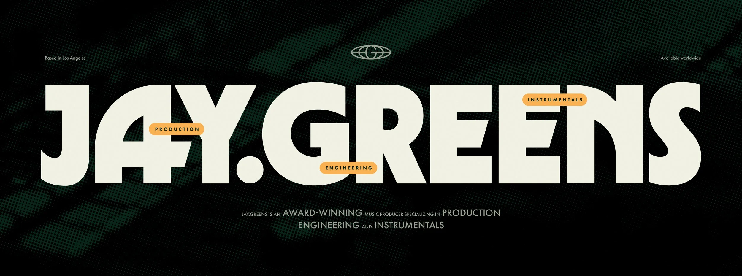
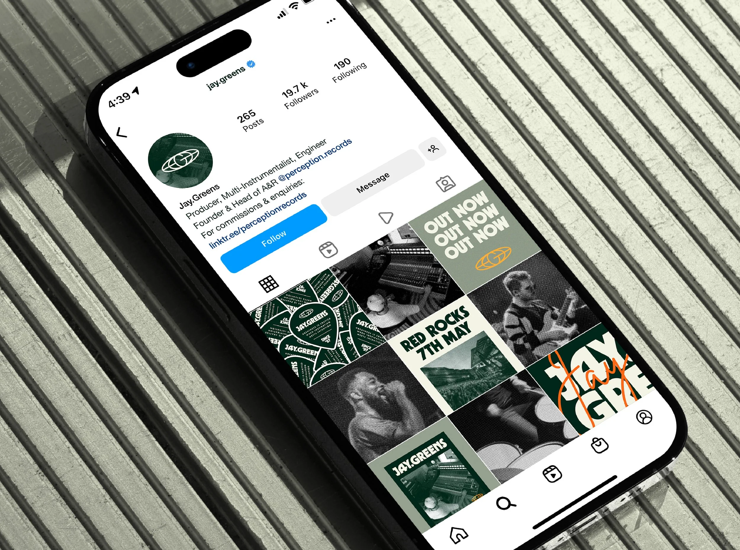
The all-round creative musician Jay.Greens needed to create an identity that would resonate with his deep commitment to creativity, authenticity, and collaboration. With over a decade of experience, Jay is known for his holistic approach to production, guiding artists across various genres to realise their unique sound. My goal was to create a visual identity that encapsulated the spirit of him as a person, his inspirations and approach to music creation and production.
The 1970s & 1980s
Jay.Greens is a Los Angeles-based producer, multi-instrumentalist, MC, and a founding producer of Perception Records. With a focus on high-quality, honest, and inspiring art across all genres, Jay.Greens blends technical expertise with a deep understanding of the artist’s journey, providing a creative environment where authentic music thrives.
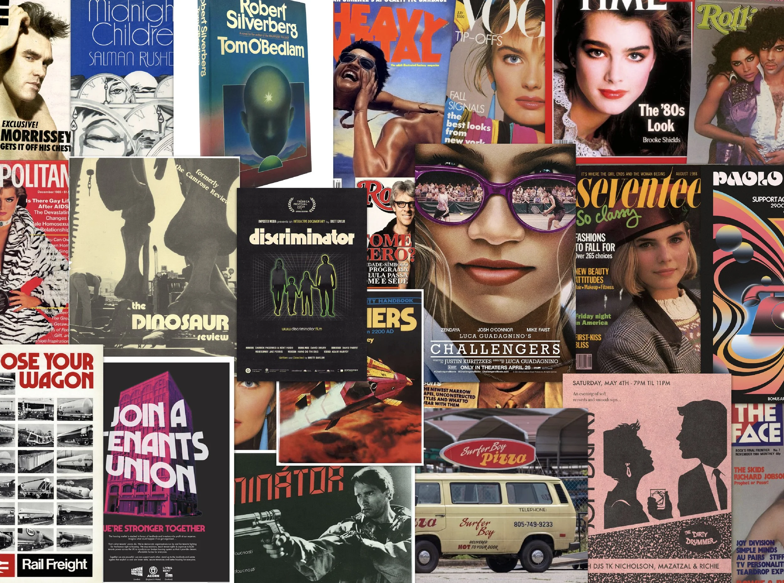
One of Jay’s biggest inspirations is the music of the 1970s and 1980s. Through our discovery session we decided to focus on this and explore visual references to this era within his identity design. I set to work scouring the internet and archives for 70s/80s logos, typography, colour palettes, iconography, imagery treatments, the lot. During this, we were drawn particularly to the typography featured in the Discriminator, Choose Your Wagon and Join a Tenants Union posters below.
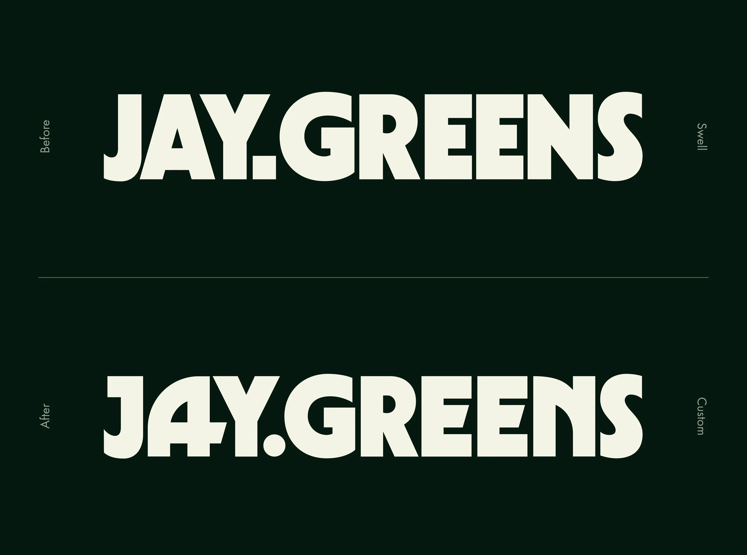
Having found a fantastic base for this typeface in Swell, I customised and redrew elements to provide better balance and cohesion across the wordmark. Particular stand outs are the new A and N letterforms which feel like mirror images of each other. This visualised how Jay collaborates with other artists, guiding them to reflect their world view in their art. Other subtle customisations, such as the unique crossbars in the A and E’s, were made drawing on other inspiration from the time to create a beautiful wordmark that feels at home yesterday, today and tomorrow.
Adding some optionality and function
Crafting a beautiful wordmark that speaks to Jay’s inspiration is fantastic but with it being significantly wider than it is tall, it’s not super functional. When seen at small scales or squeezed into a tight space, legibility becomes an issue. To tackle this, I created a suite of logo variations each serving a unique purpose ensuring Jay has a logo solution for every possible situation.
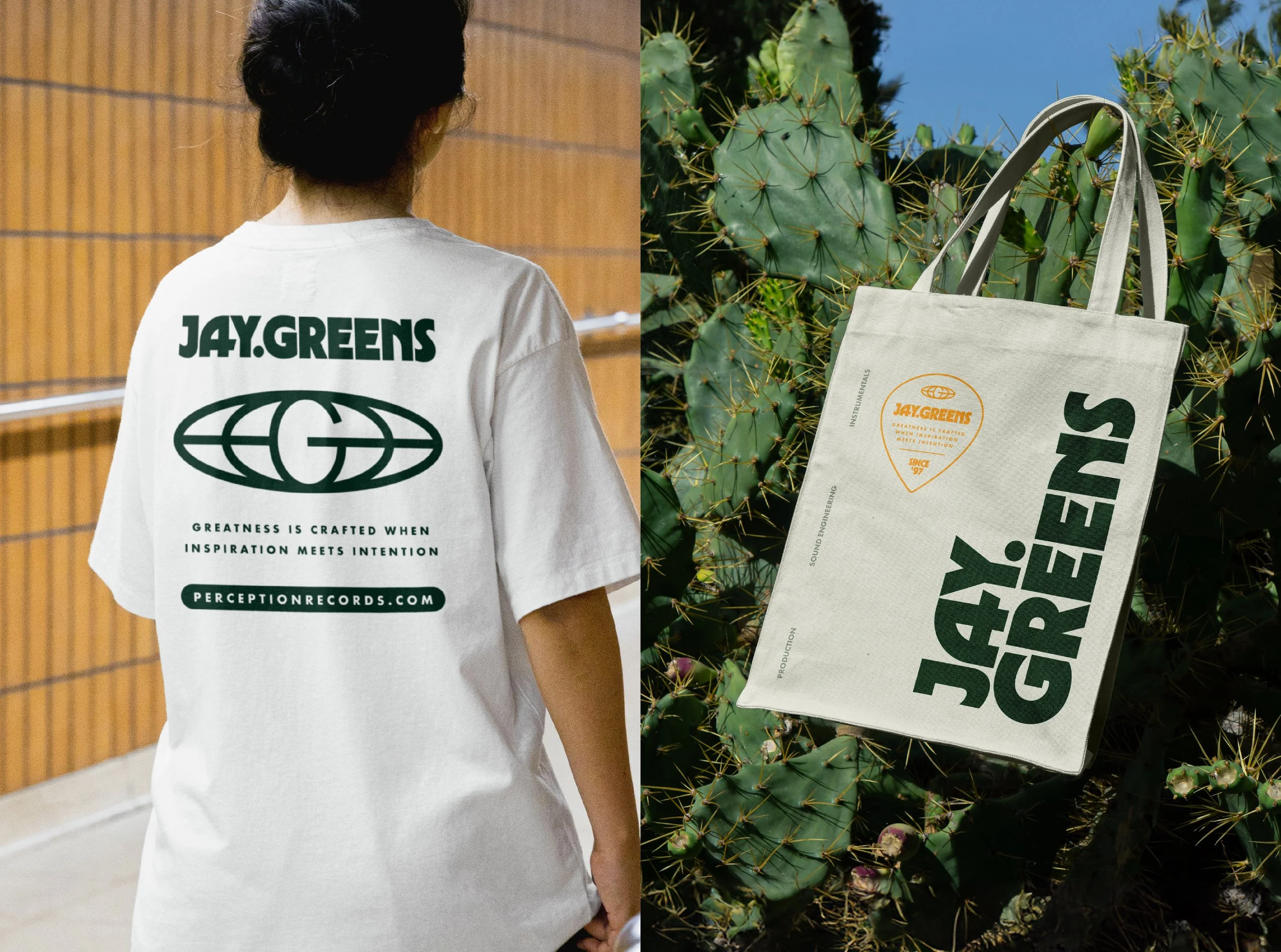
Part of this suite was a super clean submark combining a G letterform with a globe nodding to Jay’s international reach. Using this in combination with the primary horizontal wordmark and a tagline, I created a sweet badge lock up in the shape of a guitar pick - one of Jay’s go-to instruments. Together, these create a wealth of options for Jay to express his brand visually and create some killer merch later down the line.
Cementing a modern retro feel
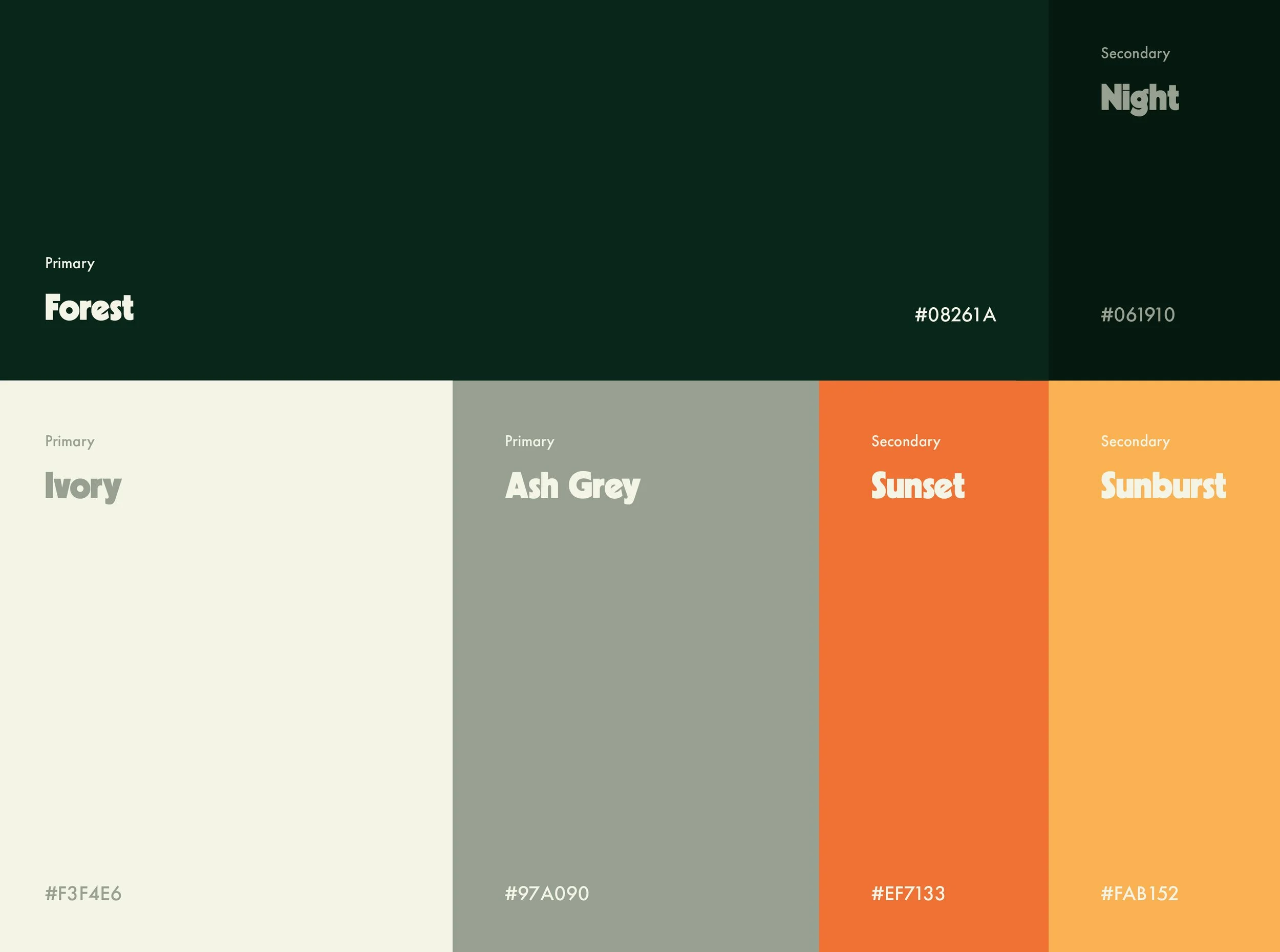
We really captured the essence of the 70s & 80s in Jay’s new logo suite but we needed to hammer this message home through the rest of the identity. To do so, I chose a couple of radiant accent colours often seen in during this era (example) to pop vs. the more muted and sophisticated hues in the rest of the palette. Not only were these colours also present during this time but the primary forest green directly links to Jay’s artist name creating a lovely relationship and added meaning.
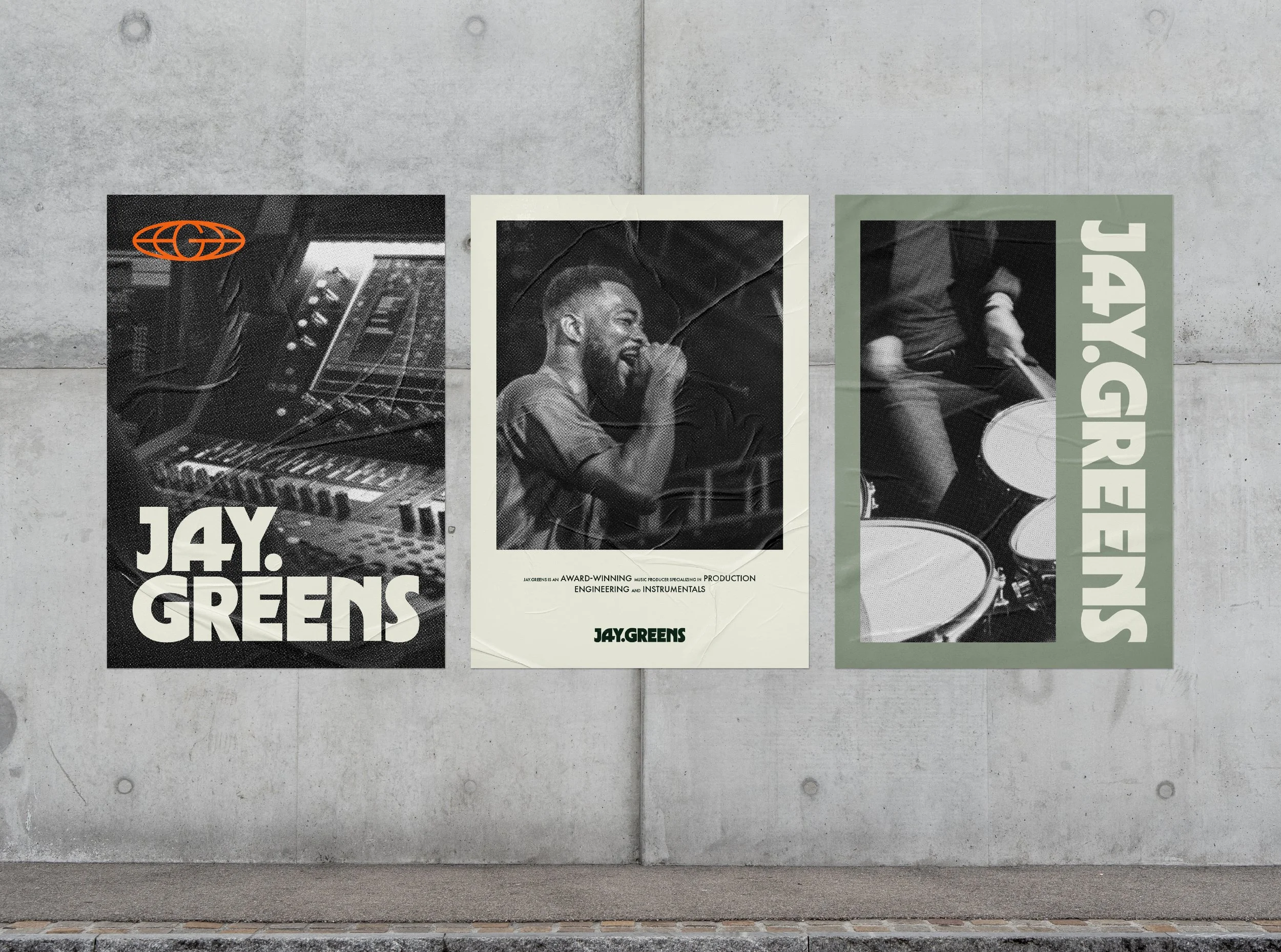
Throughout my research, I found a number of examples of halftone dots used in magazines, posters, album art, etc. so I brought this technique into Jay’s imagery treatment which further contributed to the retro vibe we were going for. Using transparency filters and colour with this effect looks really sweet and is something Jay could totally own within his niche.
Did Jay and his team have a good time?
I loved working with Jay and his team on his brand. It’s not often I get to create a bespoke type-based logo suite so this was a real treat and one I won’t forget. Here’s what Jay had to say about working with me:
“Working with Jack was an absolute pleasure. He was incredibly easy to collaborate with—professional, responsive, and open to feedback throughout the entire process. Jack's attention to detail and commitment to delivering a top-tier final product really stood out. The logo and brand design he created for Jay.Greens exceeded my expectations, and I couldn’t be more excited to build my brand with the incredible work he's done. Highly recommend Jack for anyone looking for a seamless, high-quality design experience!”

