
Kohlben Vodden
Service (s)
Logo design
Year
2025

Kohlben Vodden is a London-based visual artist creating bold and abstract artworks deeply rooted in themes of identity and transformation. With a distinctive style that blends colour, form, and emotion, his paintings challenge conventional works and invite deeper reflection. My goal was to craft a logo design that not only reflects the mystical, high-end nature of his brand but also embodies the essence of his artistic philosophy—pushing boundaries, sparking conversation, and leaving a lasting impression.
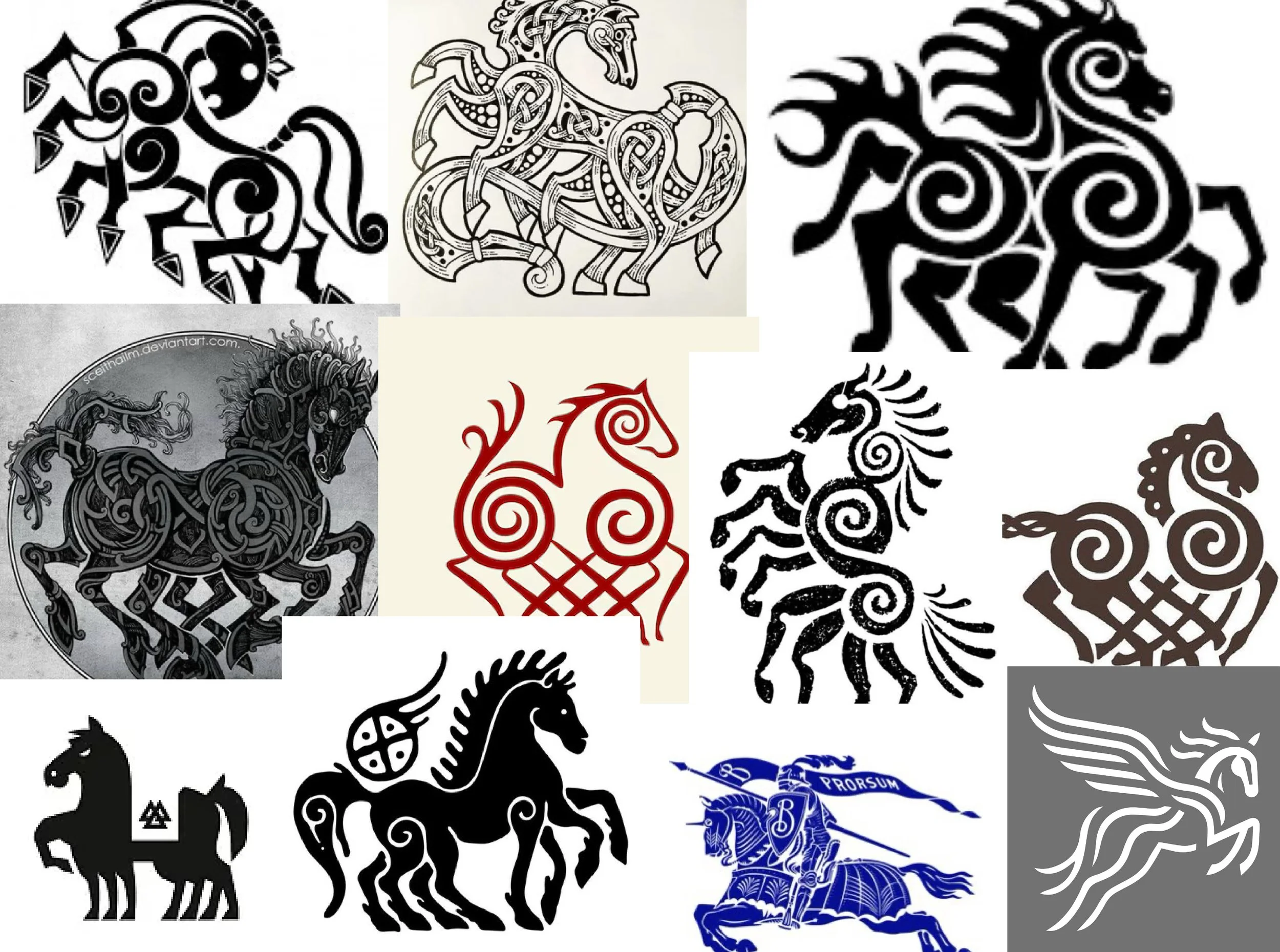

A goldmine for visual inspiration
As with most of my projects, I look to find creative territories to explore that are equally meaningful and effective for my clients. Luckily for me, Kohlben had already done a lot of the heavy lifting as he shared the etymology of his surname with me. ‘Vodden’ originated from the name of the pagan god Odin in Anglo-Saxon and Viking/Norse mythology. In other words, an absolute gold mine of visual references and inspiration.
As the story goes, in order to stop a giant from completing the build of Asgard’s walls, Loki (a trickster and shape-shifter) transformed into a mare to lure away the giant’s powerful stallion, Svaðilfari. The plan worked—the builder failed, the gods refused to pay up, and Thor killed him. Meanwhile, Loki (still in mare form) became pregnant and later gave birth to Sleipnir, a mystical 8-legged horse. Odin, recognising its power, claimed Sleipnir as his steed—the fastest and most magical horse in existence, capable of traveling between worlds. I mean, if that doesn’t get your creative juices flowing, idk what will. This concept, paired with the fact that most artists use either their signature or a relatively sterile wordmark as their logo meant we had a real opportunity to make Kolhben to stand out in his field.


Challenging convention
With this idea in mind, I set to work sketching a bunch of 8-legged horses. And by a bunch, I’m talking a couple hundred. With an eye on one of Kohlben’s brand values ‘challenging convention,’ I created a super angular execution of Sleipnir. Not only was this stylistically unique, but it served a tangible function of being more easily reproducible at small scales. I paired this with a modern take on some blackletter typography to match the Staccato nature of the Sleipnir and to root the design in England, the adopted home of Kohlben. However, after taking him through the work, we both agreed that the proportions of the horse seemed off and he wasn’t a massive fan of the angular aesthetic. Furthermore, he wanted the horse to fill a circle more completely.


Starting to go blind for horses
With my feedback in hand, I cracked through another bunch of executions. All with very subtle changes in head, leg, mane or tail position. After nearly going blind for horses and equine anatomy, I came across a very flow-y option which filled a circle well and to my eye, the proportions issues were ironed out. With this variation, I opted for a more classically modern sans-serif typeface and rounded the corners of the letterforms to pair with the curvaceous nature of the horse. This time though, Kohlben asked to see the Sleipnir’s head further back with a much more minimal mane and tail combo which he felt overwhelmed the design.

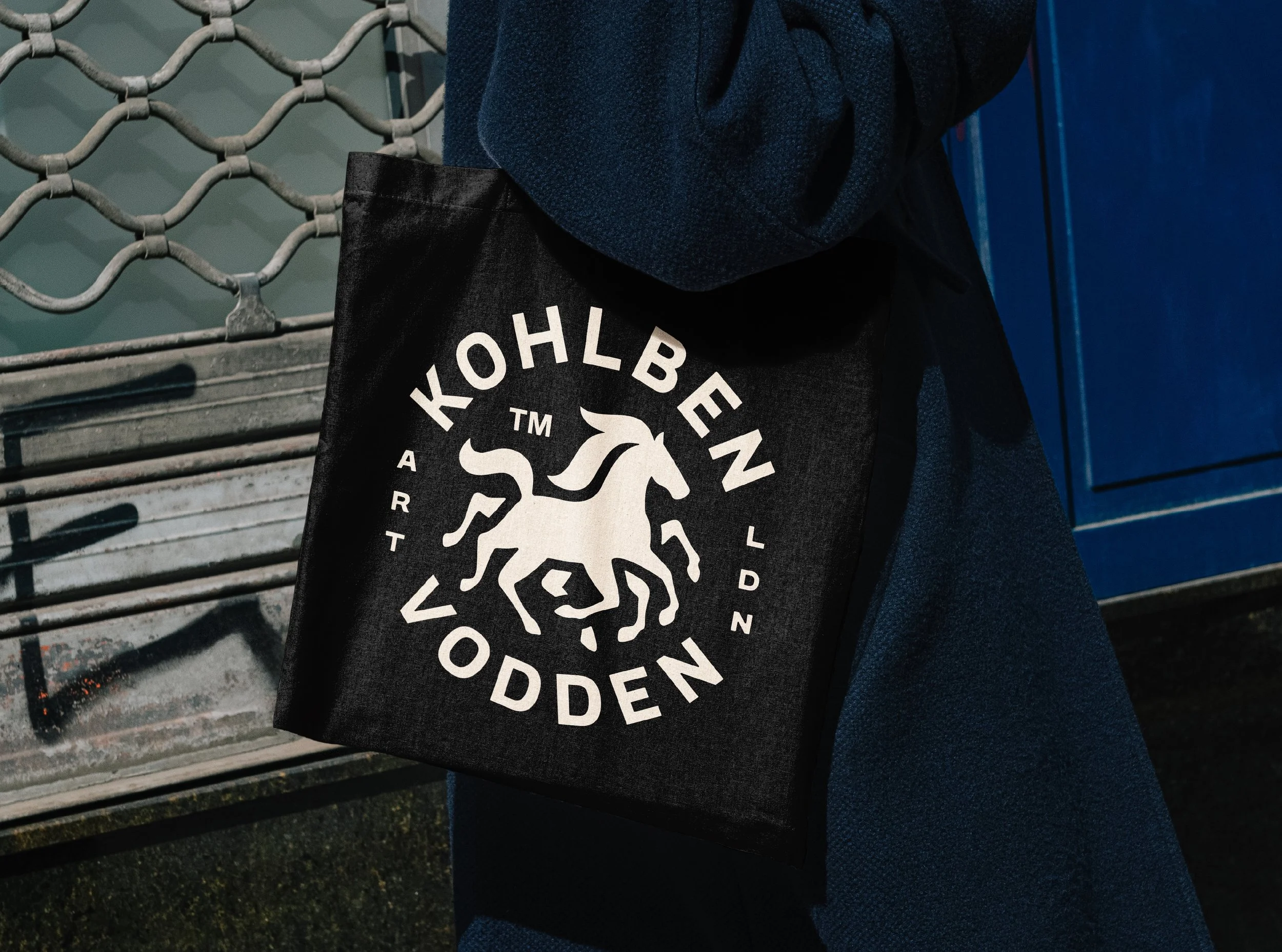
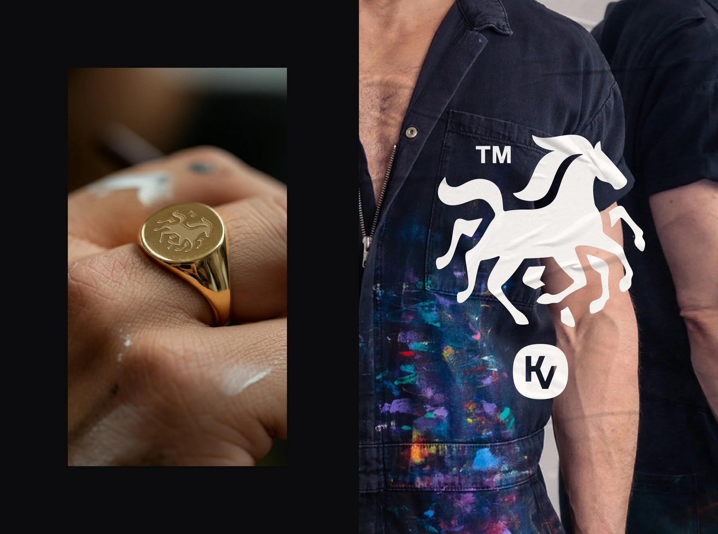
Colours for the monochromatic inclined
With Kohlben’s feedback being relatively minor, I thought I’d be able to wrap this up pronto but after several hours, I realised how tricky it was to convey movement and visual intrigue with the mane/tail whilst filling in that pesky top left area of negative space AND being minimal and reductive. But after a couple of days of sketching, I managed to simplify the mane/tail and incorporate the trademark symbol to simultaneously address Kolhben’s feedback and balance the design. STOKED. Thankfully, we had already established the typeface we’d run with in R1 but the rounded corners wouldn’t work with the new, refined Sleipnir so I dialled back the curvaceous edits in favour of slightly sharper corners.
At the start of this project, Kohlben mentioned that he wasn’t the biggest fan of colour and that it would be a tall order for me to win him over in this department. Undeterred, I saw an opportunity I had to explore. With the mystical subject matter we were working with and numerous mentions of magic in the brief, I created a metaphysical colour palette taking inspiration from the atmosphere. This brought in rich blue blacks, punchy purples and earth tones creating a set of colours that not only spoke to who Kohlben is but would easily stand him out versus his monochromatic competition. To both mine and his surprise, he loved it!

That’s a wrap!
I had so much fun on this project creating a suite of logos in a style I don’t often get to play with - what an absolute treat. Kohlben was a gem to work with providing super actionable feedback whilst being exceptionally patient with me as I nearly broke down drawing mystical horse manes. Here’s what he thought of working together:
“Working with Jack is like working with a friend who wants nothing short of the absolute best outcome for you. He combines technical and creative talent with being a good human, who genuinely cares about your project.
After discovering Jack on social media, I discovered he had a long wait list and even though I was on a mission to get my new brand identity done, I happily waited to work with someone I knew I could trust with my 'baby'.
This is coming from someone who does not give testimonials.”